
Portfolio: Allan Sharkey's artistic kitchens & baths
Testimonial:
"Tatiana worked very hard to create a great web site. Her design taste matched my wishes and the result is very pleasing."
Allan Sharkey, owner of artistic kitchens & baths
Site Information:
- Design Completed: 7/2009;
- Created With: HTML, CSS, and PHP.
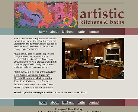
In June of 2009, Allan Sharkey contacted me with a request to create a website for his kitchen and bathroom design company, Artistic Kitchens and Baths. As well as being a kitchen and bathroom designer, Allan is also an artist who creates stunning free-form paintings. In our initial meeting, we discussed how to best represent both aspects of Allan Sharkey's work on his website.
To come up with a design for a site with such a wide variety of content was a challenge. Not only were Allan's paintings very different stylistically from the kitchens and bathrooms he designed, the kitchens and bathrooms also varied by style. I experimented in GIMP with many different image-based designs, trying to figure out a way to have the website accurately represent the wide variety of work Allan does. Eventually, I stumbled upon a PHP-based slideshow script that provided a solution. With a slideshow, the viewer would be exposed to several different images, which could show the variety of work Allan does.
With the basic design idea approved, I went about creating the test site. Along with the usual complications (i.e., Internet 6 and 7 compability issues), there was the additional complication of figuring out how to integrate the PHP slideshow code in with the HTML and CSS I created. When the base design is created, the specifics (for example, exactly how wide an element is) are left out. What's given is the percentage and basic layout. While creating the test site, I had to decide how wide the page was going to be, if the page was scalable or not, and how wide the elements inside the page would be. Eventually, I decided on a page 800 pixels wide, that would be centered, and have the menu bar expand beyond the 800 fixed width page. Once that was done, the width of the interior elements had to be figured out.
Allan's website consists of 4 main sections: the header, the menu bar, the content, and the bottom menu bar. The header would be 800 pixels, as would the main section of the menu bars. To achieve a 2-part header that would scale reliably when text-size was increased or decreased, I combined two very different methods. First, the logo painting was floated to the left while the title was floated to the right. This worked in the default setting, but produced very odd results when the text-size was increased. To fix this, I created a table for the header, with the logo in one cell and the title in another. This allowed the header to function the same, no matter the text-size.
The menu bar was fairly simple, though it contained two parts. The active menu bar (where the links are) is contained within a CSS element. For the active menu bar, I created a gradient image from two colors in the painting, the green in the bottom and the reddish on the right. This draws the eye to the right side of the menu, below which is the image section of the content section. Then, I created an image that used lighter shades of the green and the red. This image was set to the background of the element within which the active menu bar was contained. This image fills the empty space that would result if the viewer's browser resolution was higher than 800 pixels, which is often the case.
The content section had two sections: text and image. The text section is on the left while the image section is on the right. This is the opposite of the header, which has the image to the left and the text to the right, and provides symmetry to the site. In the content section, the main concern was how large the image section should be. If it was too small, the image wouldn't show enough details; if it was too large, the text section would be difficult to read.
Once the test site was completed, Allan and I met again to discuss it. He was pleased with the results and gave me the go-ahead to start filling out the pages with content. The main feature of Allan's site was two galleries, one for kitchens and one for baths. Creating the two galleries involved figuring out navigation (since the gallery pages weren't included in the menu bars), editing and resizing images, and creating a new design for the content section (since these pages were all images and no text, the content section design for the index page wouldn't work). The galleries also allowed me to make use of the PHP I've learned, as I created variables that reduced the amount of typing needed to create new pages. Instead of having to manually change the names of the images and the next image links, I only have to change one or two variables. This allows for much easier updating in the future.
Once the content was completed, Allan and I met to verify the content was what he wanted and that he was happy with the design. He was. On July 25, 2009, Allan's site officially went online.