Portfolio: Third Haven Friends Meeting

Testimonials:
"The website, especially the voluminous announcements, are beautiful. Thanks for organizing all of this."
John Hawkinson, member of Third Haven Friends Meeting
"Just wanted to let you know how nice the Third Haven Friends Meeting website looks. The info is clear and the layout attractive to the eye. The changing photos of the meeting houses and grounds are a real plus."
Dee Rein, member of Third Haven Friends Meeting
"What a wonderful job you have done to our website. You have increased the attractiveness and functionality of the site by many orders of magnitude. The layout, the calendar page, the directory page, etc., etc., etc. are all the hand of a professional. What a wonderful gift you are giving to the Meeting."
Ralph Young, member of Third Haven Friends Meeting
Site Information:
- Website Address: ThirdHaven.org;
- Design Updated: 2/2012;
- Design Completed: 3/2010;
- Created With: HTML, CSS, and PHP.
As a member of Third Haven Friends Meeting (Quaker), I became aware that the website could benefit from a redesign. The old design was based in frames, an out-dated method for creating one file for a menu that can now be accomplished easily by using PHP. The frame-based website also prevented users from being able to bookmark the current page. In short, the design would have been current in the late 1990s, but was woefully out-of-date in 2010.
Once I joined the Communications Committee, I suggested a redesign for the website. There are both benefits and downsides to redesigning an established website instead of creating a brand-new website. The main benefit is that the content is already there: I could see how the content could be restructured to be easier to find and knew about how many pages were going to be on the redesigned site. The downside is that an established website, especially when the website design has lasted several years, sets expectations for a new one. Regular users of the site will judge the new design by their familiarization with the old design.
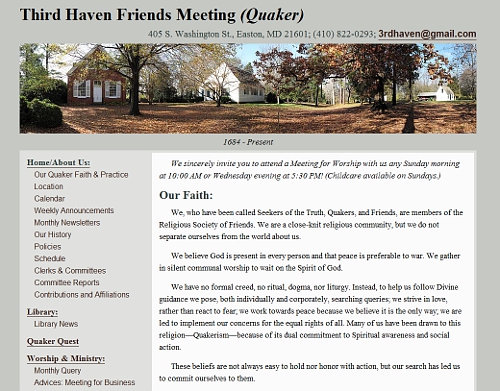
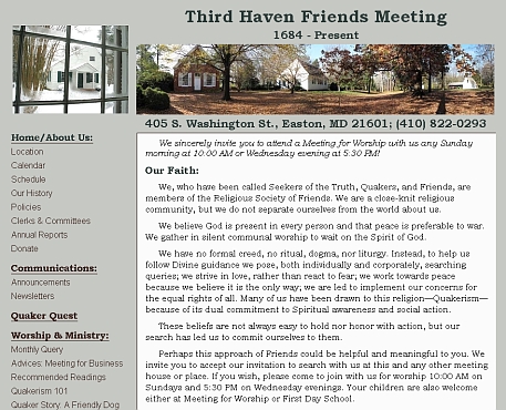
Because the Third Haven website's design was well-established, my goal was not to come up with a completely different design; but, rather, to create a design that emulated the old one while correcting its flaws. Instead of a frame, I created a PHP template, though I left the menu on the same side of the page as before. The header was a new addition, as the old website lacked a header on every page except the index page. The slideshow was on the original page, but the slideshow on the new design is PHP-based instead of flash-driven. This allows me to easily add new images to the slideshow.
I also changed the color scheme, which I was, at first, hesitant to do. The original color scheme (a light yellow with brick red highlighted text: links, headers, etc.) was very pleasing, but it didn't seem to be connected to Third Haven in any specific way. The color scheme I created derives its colors from the images in the header and slideshow. The dark teal of the header text, in particular, is a color that is often used in Third Haven printed materials and on our "Welcome!" sign. The grey as a background choice is derived from the shadow on the "Old" Meetinghouse in the header and is consistent, as a grey, with the Quaker Testimony of Simplicity.
The menu itself contains more items and two levels (header items and sub-menus) than most site navigations I use in my designs; however, the original site's menu made it very easy to see all of the pages, without having to visit specific pages to view sub-menus. While this design goes against the philosophy of having no more than 7 items in a menu, I believe the menu speaks to the Quaker testimonies of Integrity and Simplicity. Every menu link is visible from every page; nothing is hidden. This is an open and easy way to see what's on the website.
As with many websites, getting the content updated can be a struggle. At Third Haven, there are many committees who would benefit from updating or adding content to the site; however, these committees are often occupied with the work pertaining to the committee. I hope the committees in the future will find the time to review their materials on the website.
I look forward to updating the content on this website.
In 2012, I updated my original design by moving the slideshow to a new footer section, making the header image larger, and adding a background color to the menu and borders of the content area to increase the sense of connectedness between the website elements. Below is a snapshot of my original design.

